PROJECT TYPE
Internship
YEAR
November '24 - December '24
SCOPE OF WORK
Product Design, UX Research
TOOLS
Figma, UserTesting
Elevating Flight Status at Breeze Airways
Breeze Airways, which launched its first flight in 2021, is the fastest-growing airline in the U.S. and recently recorded its first profitable quarter. With this rapid growth comes the challenge of continuously evolving our digital products to meet new demands.
To support this expansion, I led a redesign of the flight status page, creating a more intuitive, mobile-friendly experience that enhances transparency and convenience for Breeze’s guests.
Act 1: The Stuggle
Checking a Flight's Status Should Be Effortless.
With the current Breeze Flight Status page it is not. For users tracking others, and passengers tracking their own flights, clunky forms, hard to decipher flight information, and the lack of optimization for mobile made this page an obstacle rather than a helpful tool, falling short of Breeze’s goal to make travel ‘seriously nice.’
In late 2024, stakeholders tasked me with helping this page “grow up”, improving its form and function, while introducing new features like flight notifications and future support for partner-operated flights. My goal was to create a seamless, intuitive experience that made it easy to track a flight, no matter the situation.
Act 2: The Search
Auditing the Current Page & Flow
I started this project by interacting with the current Breeze flight status page, flow, and taking notes on all the issues—and there were many.
Auditing Other Airlines
After taking notes on Breeze, I looked at other airlines flight status pages. I found some things I liked to take inspiration from, but overall I wasn’t super impressed. It seemed like most struggled with the same challenge: presenting all the essential flight details in a clear, intuitive way. It became clear that there definitely was an opportunity to create a more elegant, user-friendly solution.
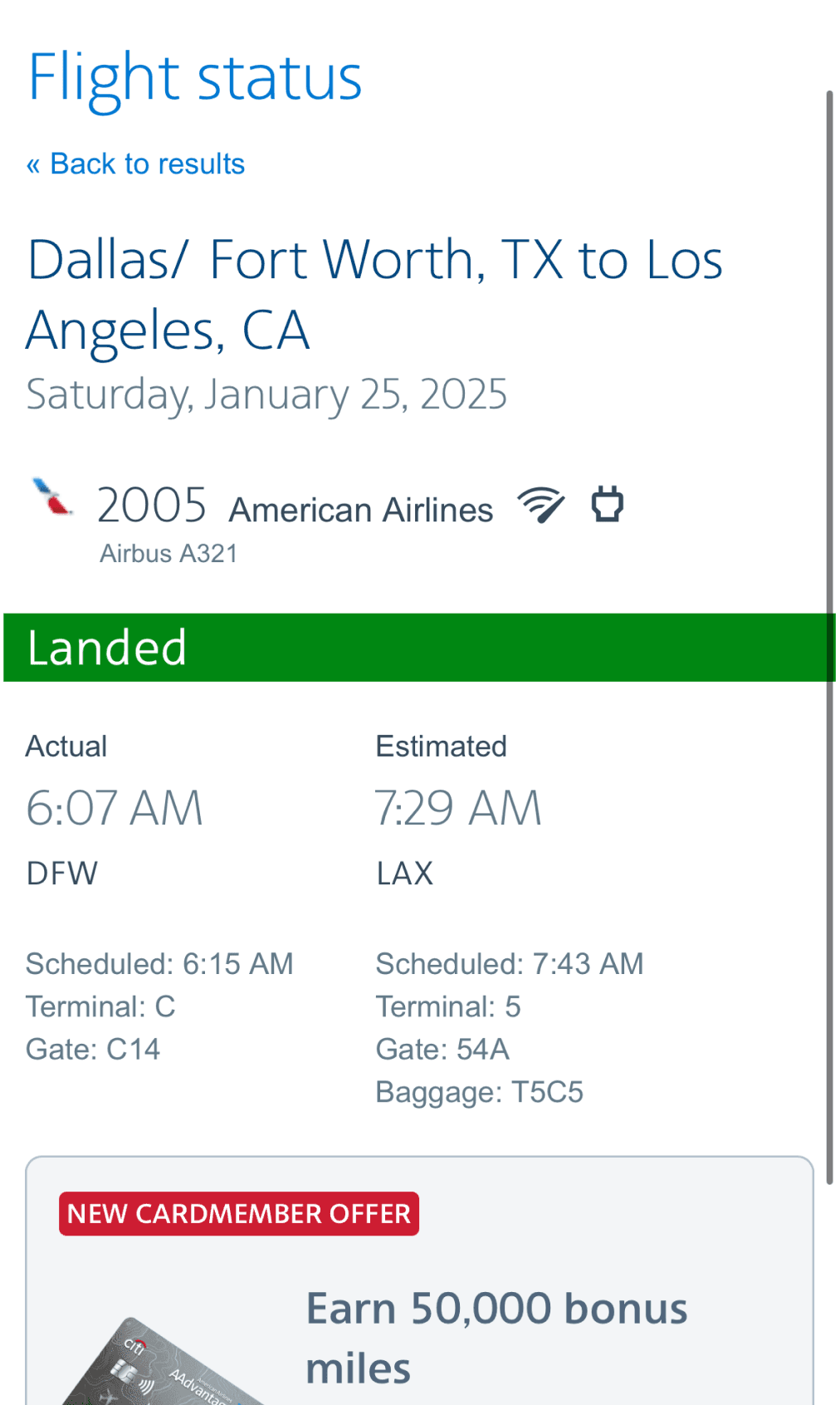
American Airlines
I think this page does a good job at using hierarchies to help users identify info, even if I do think the text is a little too grey & light weight to read.
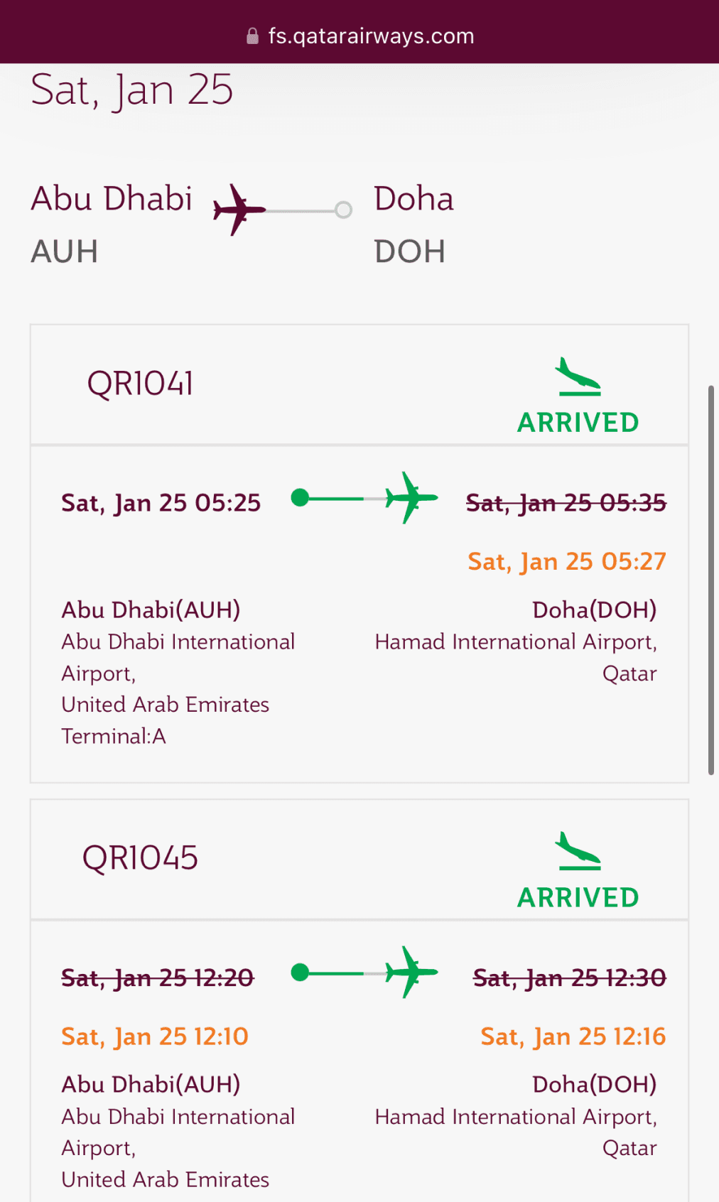
Qatar Airways
Way too many colors are used here & I find the type a little hard to read, but I do like how their timeline helps visually identify what state the flight is in.
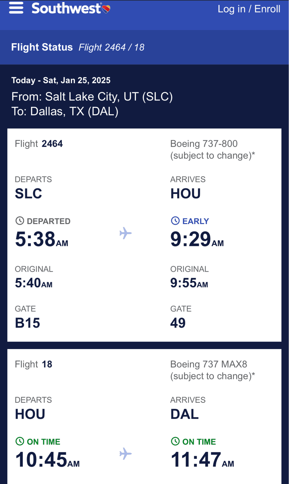
Southwest
This page is pretty ugly, but I do like how the ample amount of spacing makes things very readable.
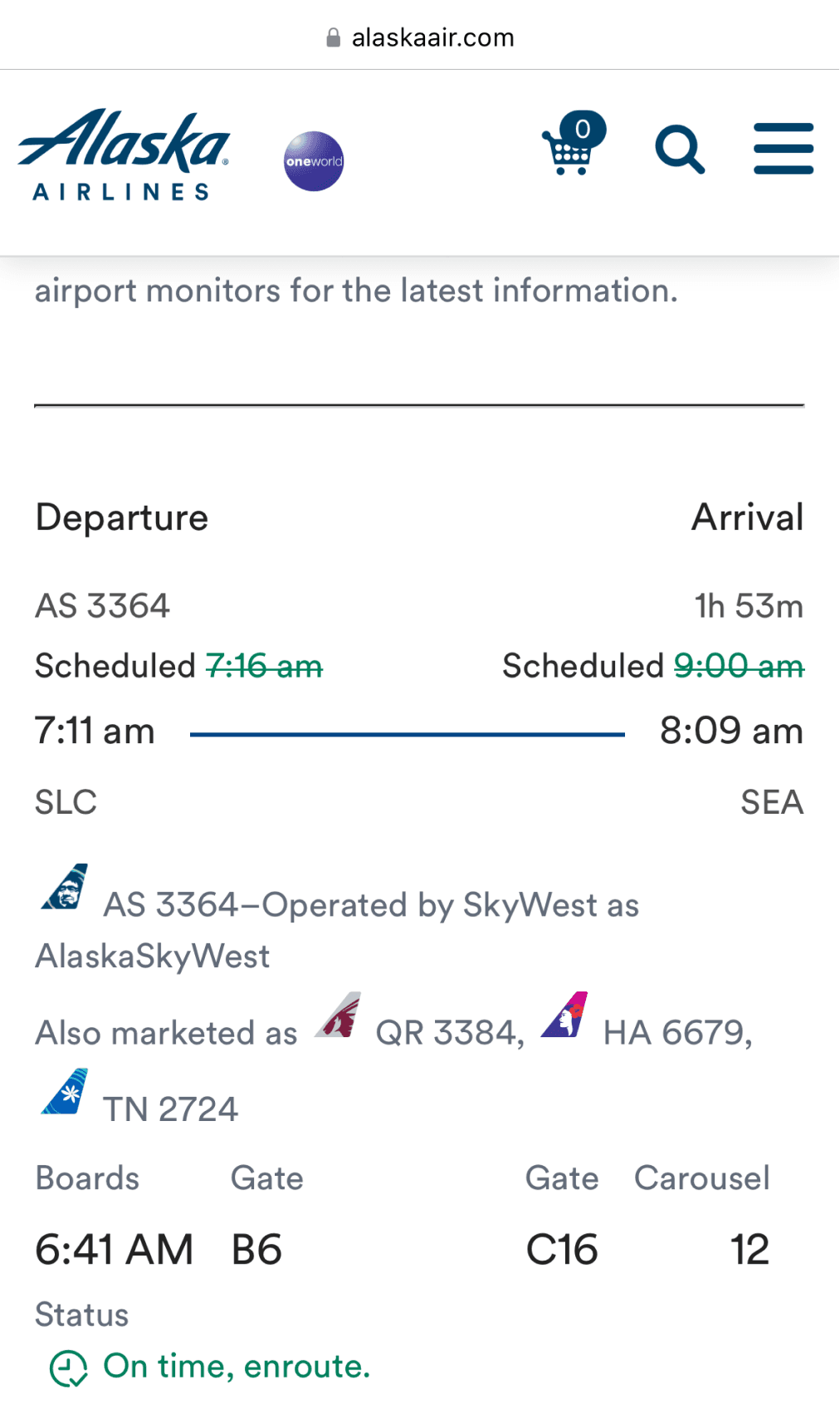
Alaska Airlines
Here I pretty much hate everything. There is so much going on here, so many weird alignment things that I can not distinguish this info.
Act 3: The Journey
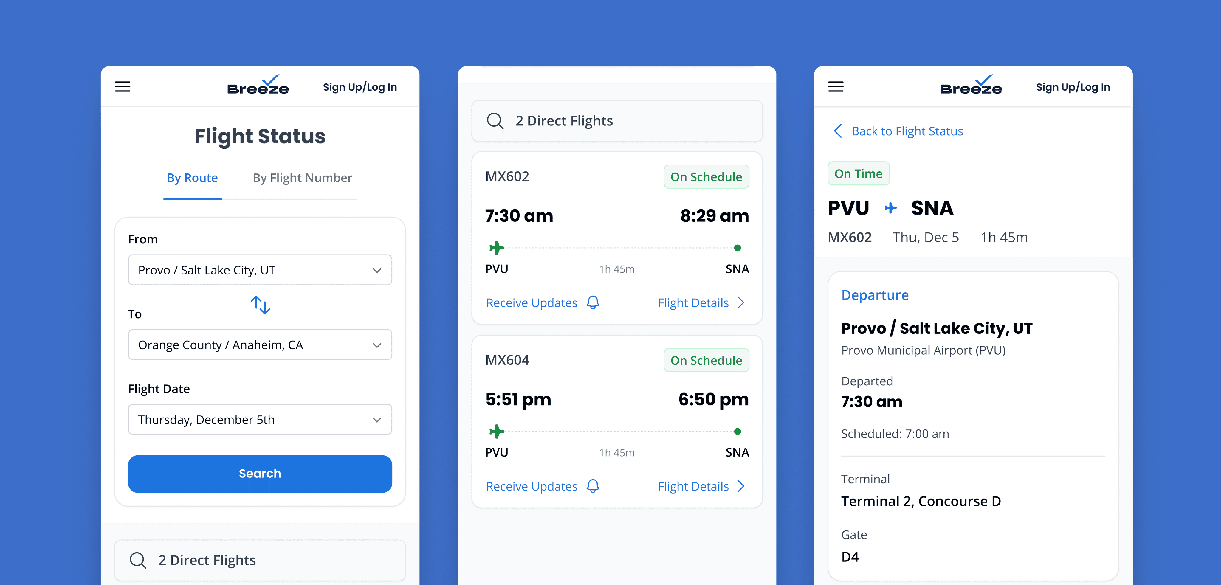
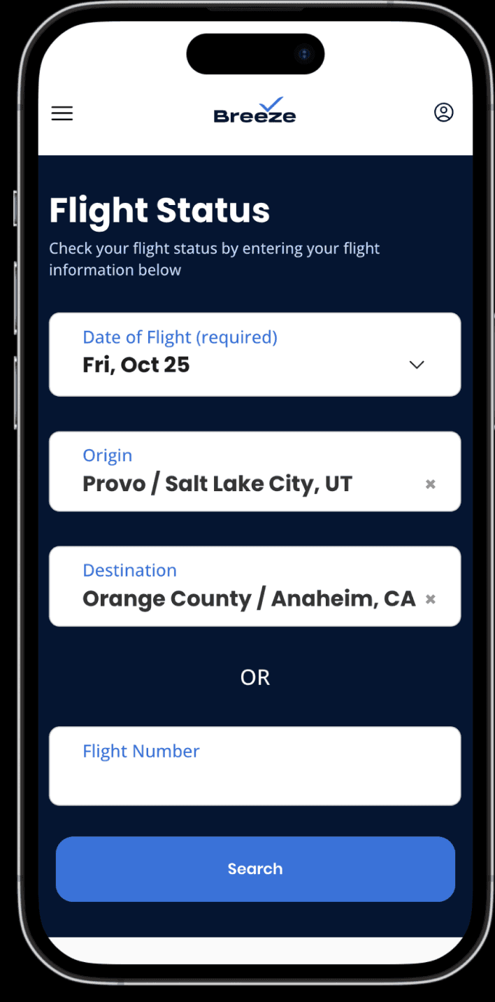
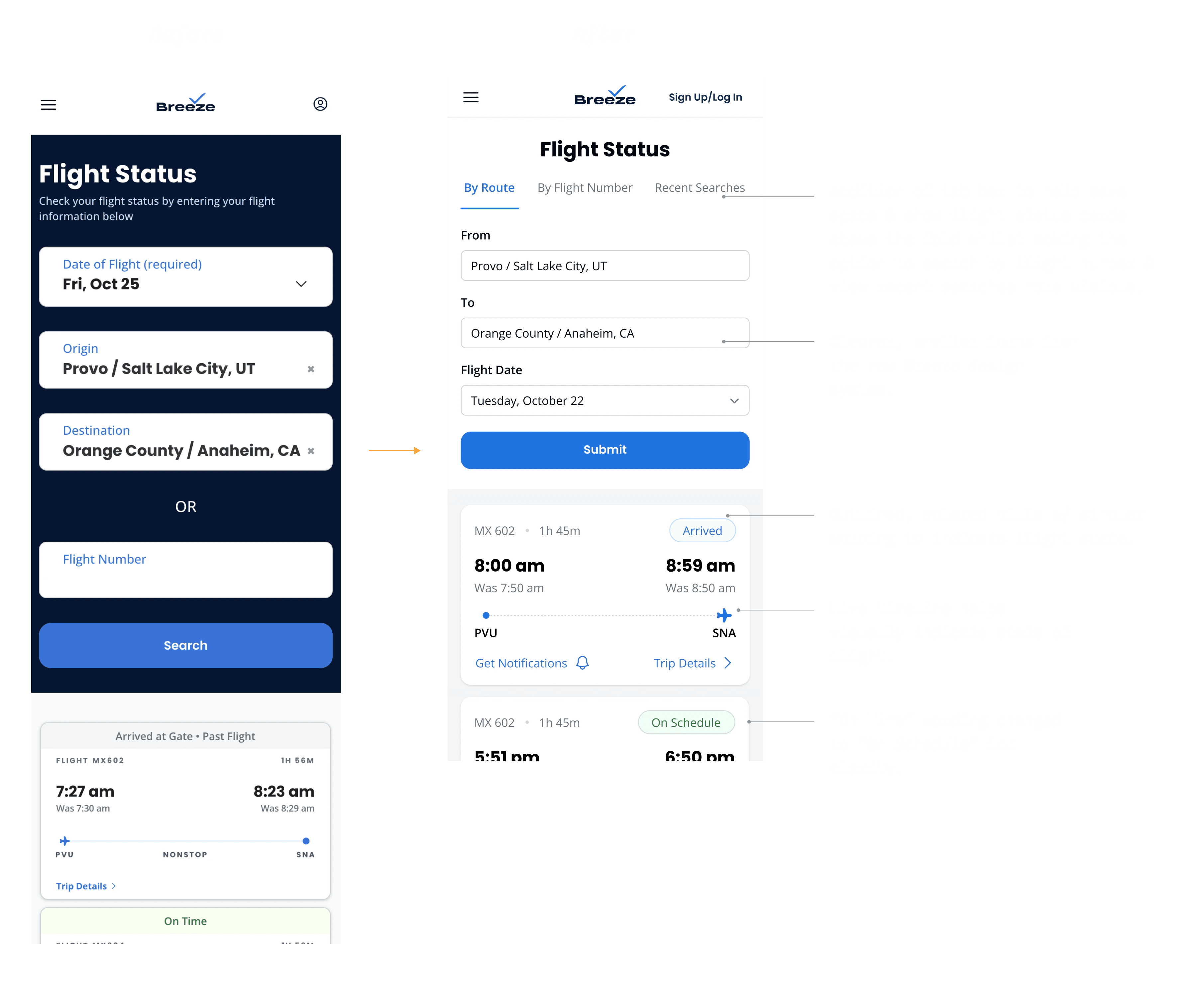
Initial Designs
After the audits, I spent some time workshopping different ideas & layouts for this flight status page. I landed on something I felt was strong and provided a lot of value in different areas.
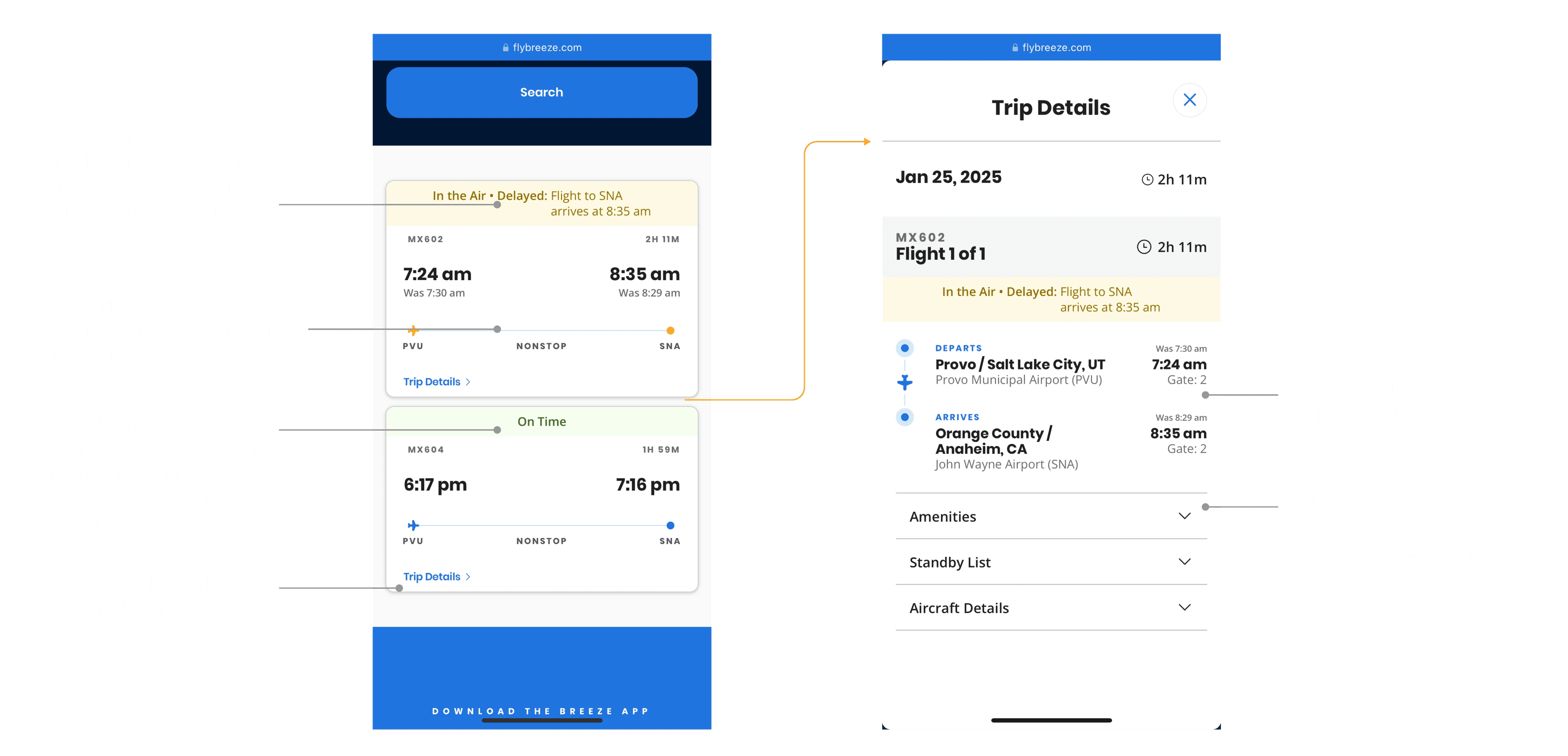
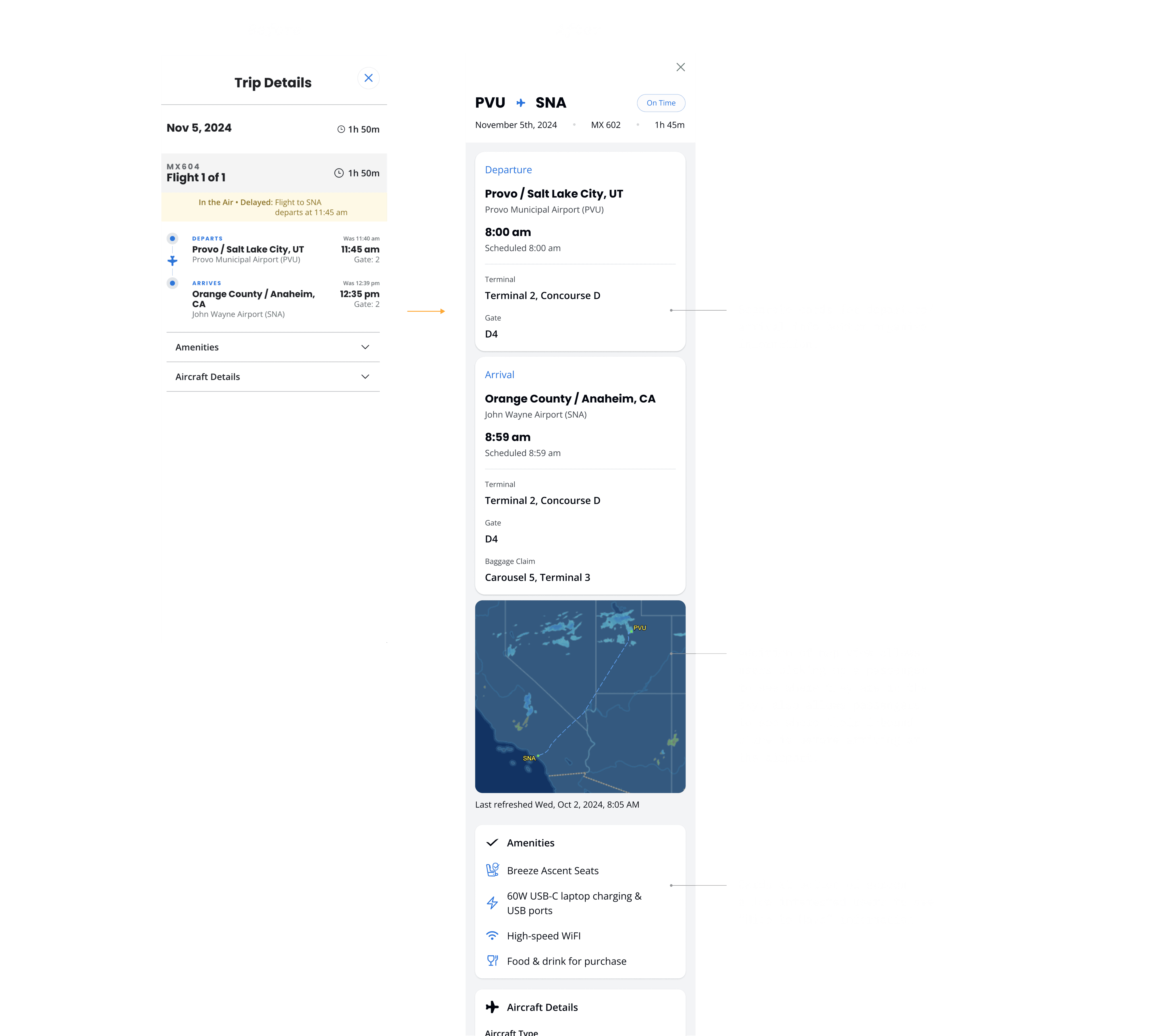
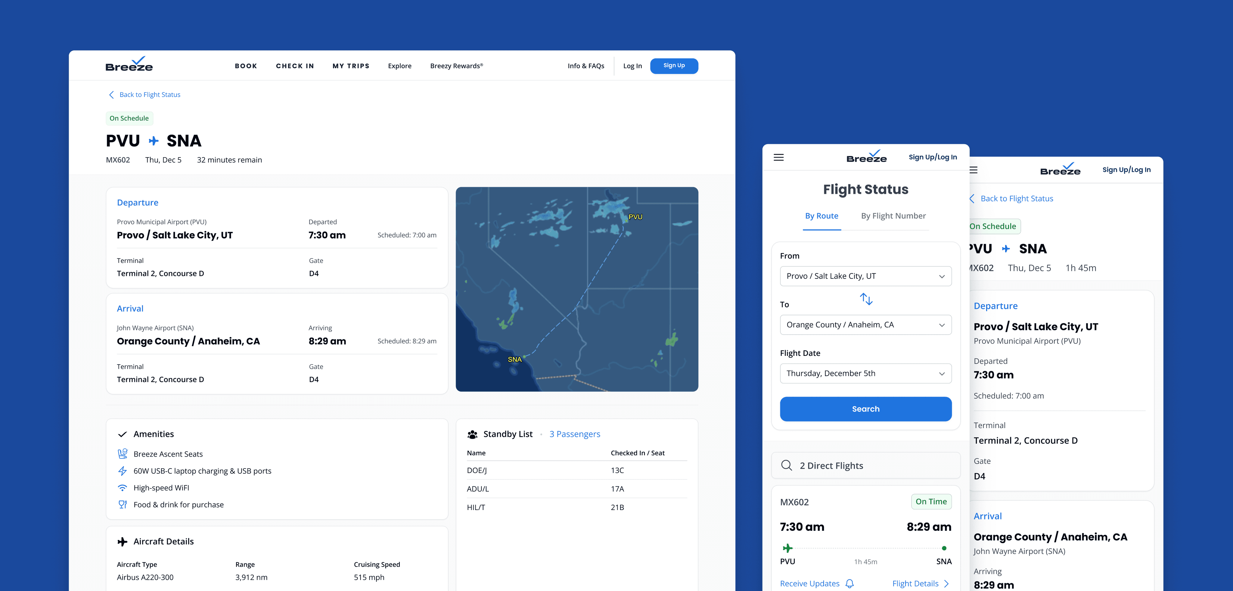
Going from Trip Details Modal to Page
Modals have their time and place, but the “Trip Details” modal had become so unruly that it was more frustrating than helpful, especially on mobile. I redesigned it as a dedicated Trip Details page, offering a more spacious layout for browsing trip info and incorporating a new flight tracking map view that stakeholders wanted to see.
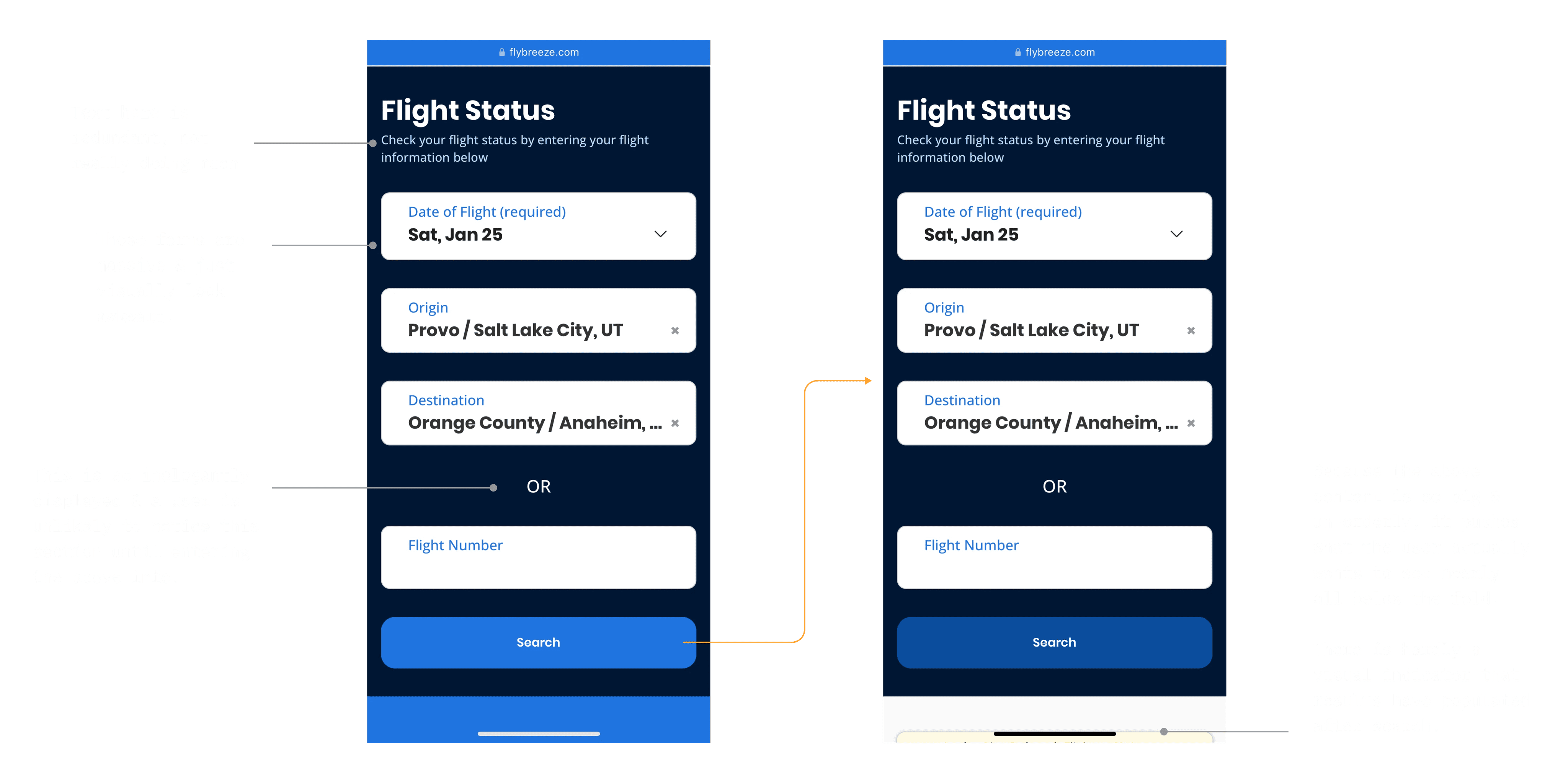
Getting Feedback
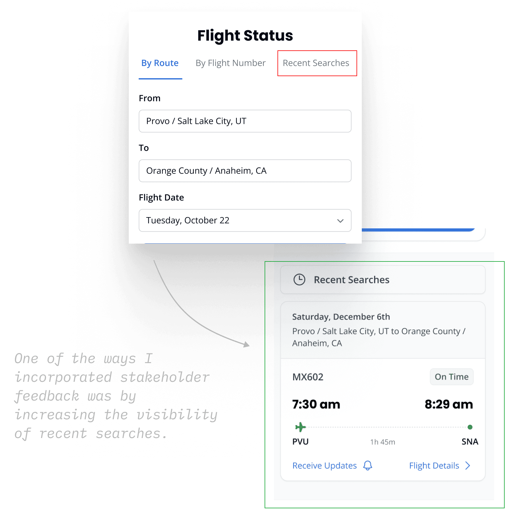
I presented these designs in a 1:1 with my PM and later in a product design review meeting with about 12 stakeholders, including PMs, designers, our head of product, and a data analyst. I received valuable feedback on layout tweaks and additional use cases to design for. One major critique was my tab bar—stakeholders were skeptical about hiding recent searches behind a tab and preferred it as an anchor link or a visible part of the page.
On to UserTesting
After incorporating stakeholder feedback, designing for more use cases, and creating desktop versions, I tested prototypes with users—my favorite parts of UX design. This is where all the answers emerge: what’s working, what’s not, and how to improve.
In hindsight, I wish I had tested earlier in the process. Getting user feedback sooner would have saved me time and prevented a lot of assumptions as I was designing. But every project is a learning experience, and this has shaped how I approach design moving forward.
At Breeze, we use UserTesting to gather asynchronous user feedback. I wrote a script, targeted users who had booked a flight in the past year, and then reviewed multiple tests for both desktop and mobile, taking notes on key observations.

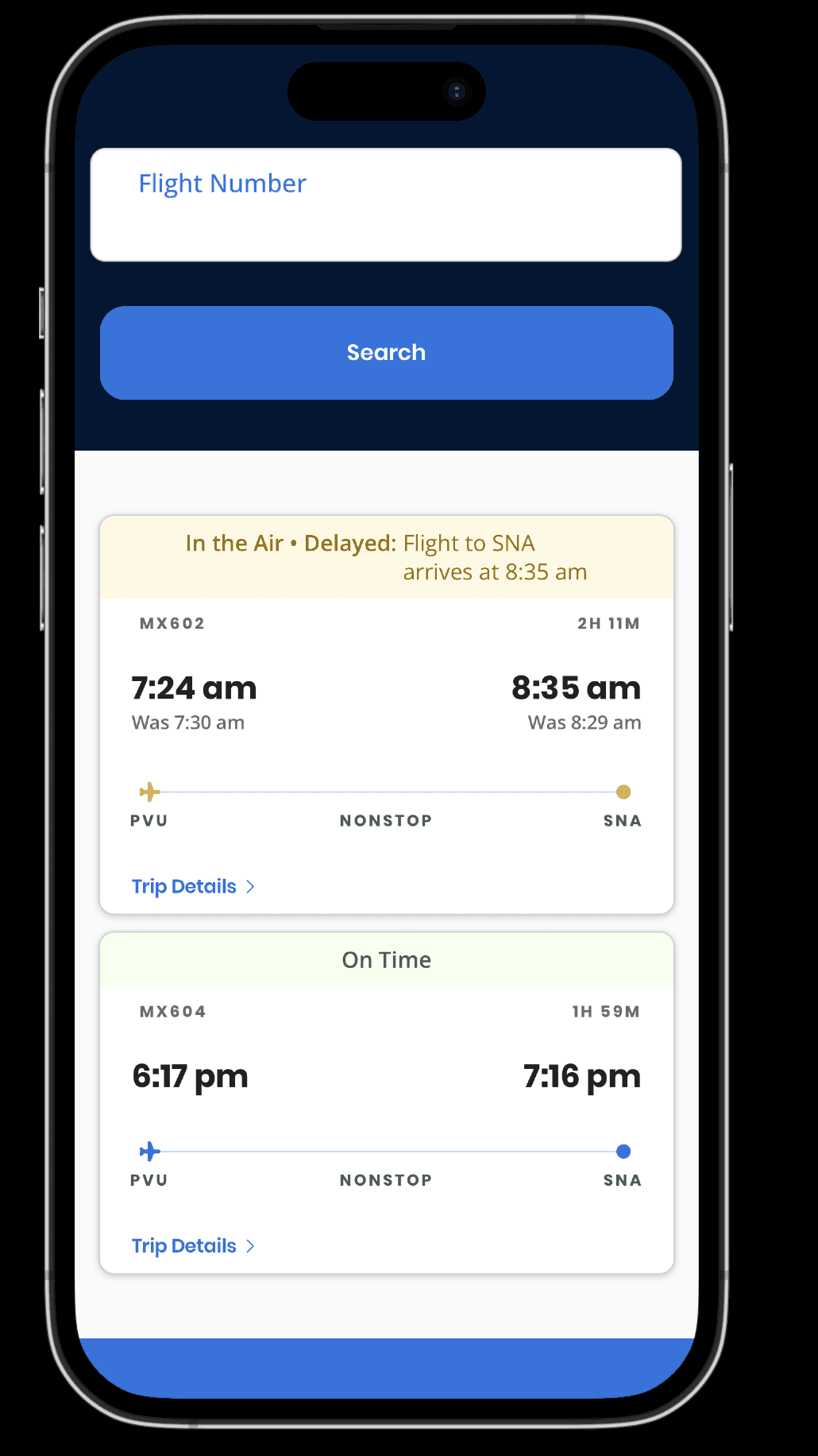
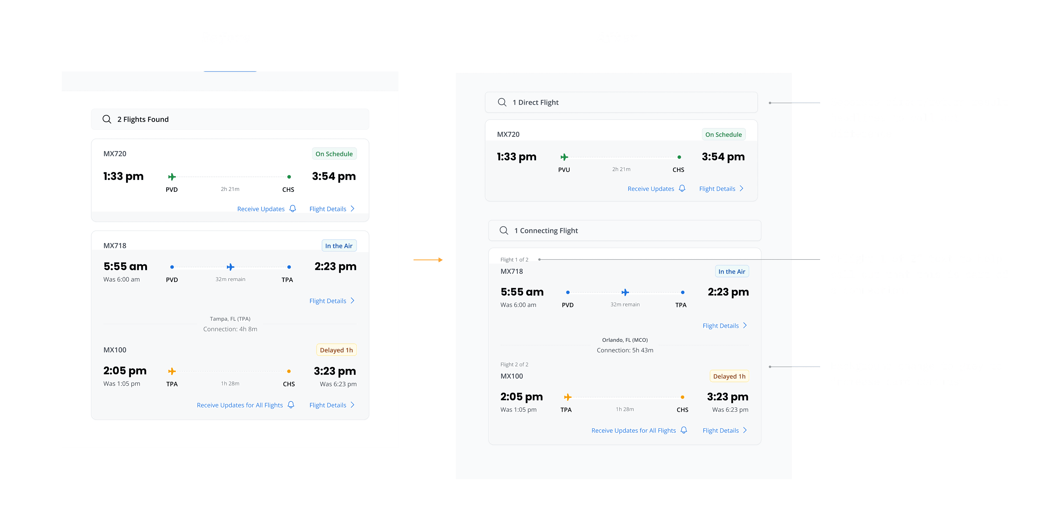
Flight Card Confusion on Desktop
One of my observations in Desktop testing was that when looking at search results, users struggled to identify the difference between a direct flight & a departing flight. They also had a hard time distinguishing the cards from the background. I made some subtle changes to help solve this.
Act 4: The Result
Final Designs
After iterating on some findings from UserTesting & testing again, user feedback was overwhelmingly positive. Designs were shared & reviewed with stakeholders who expressed approval as well. These designs are currently in development, and I’ll update this page with the link to the final page when live.
This project was overall an incredibly rewarding experience—I had the opportunity to take ownership of a major initiative at Breeze, refine my skills, and gain valuable insights along the way.
“This feels like a complete success... it’s the simplicity of it... no matter your age or technology background, this is something that everyone can use and feel good doing so”
-
Feedback from a user test
“Honestly I like this page a lot better [compared to other airlines] because it has cards. It’s easier to navigate, easier to see. When something is delayed or on time the color changes, so I think that this is a much more helpful view compared to other sites. Other sites its kind of just like "here's a big list of whats going on” & they don't give you the [status] colors. This is more compact and it's a just a lot better this way”
-
Feedback from a user test